坐标轴label移动到图形内部最左边
有时候我们画条形图的时候,由于坐标轴的label太长而占用空间太大:
library(ggplot2)

mpg$class <- paste(mpg$class, ",long axis label test")
p <- ggplot(mpg, aes(class)) +
  geom_bar() +
coord_flip()这时候可通过把坐标轴label移动到图形内部,以增加图形面积使之更加美观。首先想到采用geom_text()添加文本标注:
# 构建label数据,纵坐标为0,横坐标为class
label_df <- data.frame(class = unique(mpg$class),
  y = rep(0, length(class)))
# 删除原有label,并添加text标注
# 图行flip后,只有theme的x, y 会交换,geom中不需要改变
p + geom_text(data = label_df, aes(label = class, y = y), hjust = 0) +
  theme(axis.text.y = element_blank())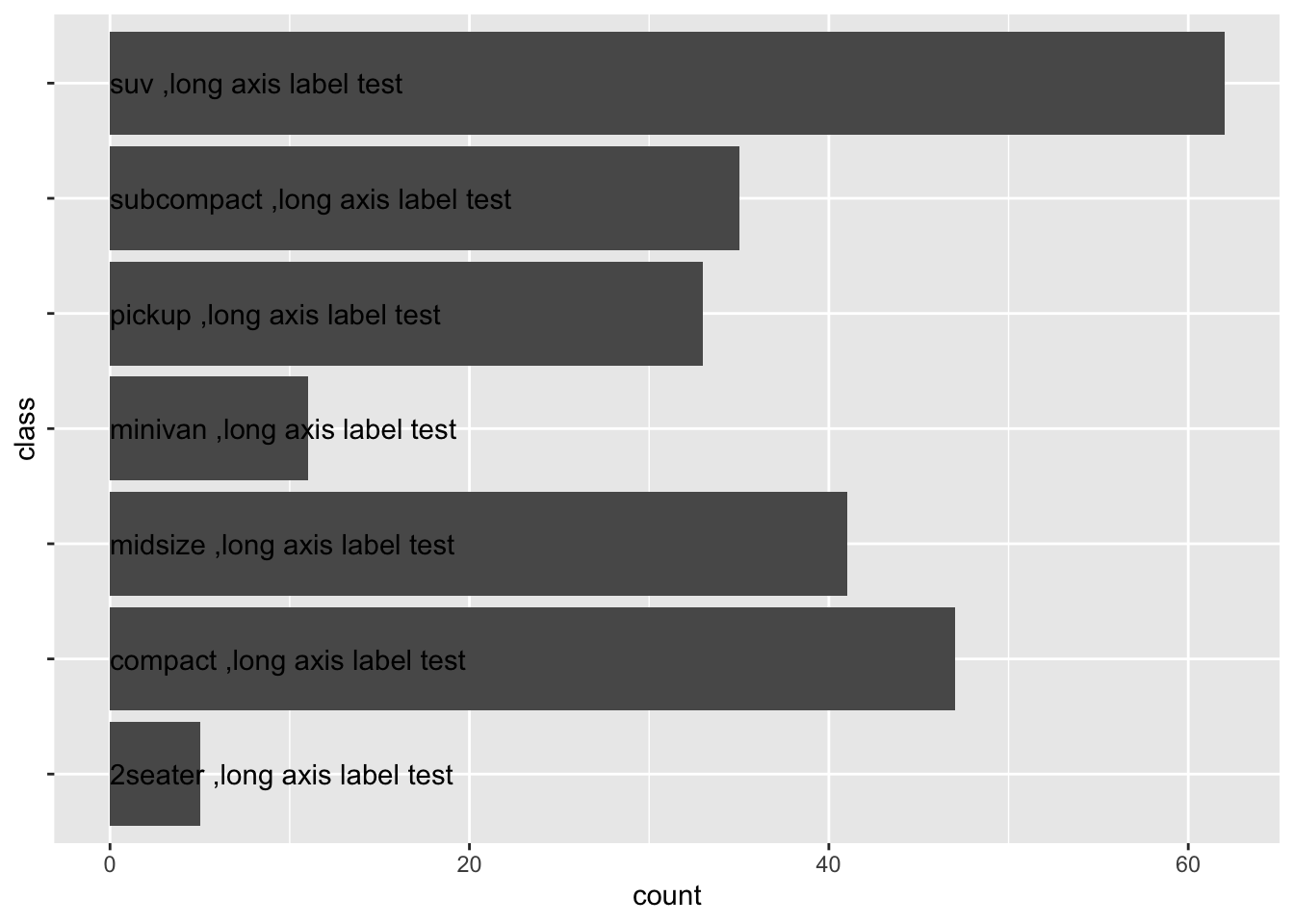
然后想到是不是可以通过修改grob修改呢,在SO上看到了一个解决方法。
library(grid)
library(gtable)
# 首先 label左对齐
p2 <- p + theme(axis.text.y = element_text(hjust = 0))
gp <- ggplotGrob(p2)
# locate the grob that corresponds to y-axis labels
y.label.grob <- gp$grobs[[which(gp$layout$name == "axis-l")]]$children$axis
# remove y-axis labels from the plot, & shrink the space occupied by them
gp$grobs[[which(gp$layout$name == "axis-l")]] <- zeroGrob()
gp$widths[gp$layout$l[which(gp$layout$name == "axis-l")]] <- unit(0, "cm")
# create new gtable
new.y.label.grob <- gtable(heights = unit(1, "npc"))

# place axis ticks in the first column
new.y.label.grob <- gtable_add_cols(new.y.label.grob,
                                    widths = y.label.grob[["widths"]][2])
new.y.label.grob <- gtable_add_grob(new.y.label.grob,
                                    y.label.grob[["grobs"]][[2]],
                                    t = 1, l = 1)

# place axis labels in the second column
new.y.label.grob <- gtable_add_cols(new.y.label.grob,
                                    widths = y.label.grob[["widths"]][1])
new.y.label.grob <- gtable_add_grob(new.y.label.grob,
                                    y.label.grob[["grobs"]][[1]],
                                    t = 1, l = 2)

# add third column that takes up all the remaining space
new.y.label.grob <- gtable_add_cols(new.y.label.grob,
                                    widths = unit(1, "null"))
gp <- gtable_add_grob(gp,
                      new.y.label.grob,
                      t = gp$layout$t[which(gp$layout$name == "panel")],
                      l = gp$layout$l[which(gp$layout$name == "panel")])
grid.newpage()
grid::grid.draw(gp)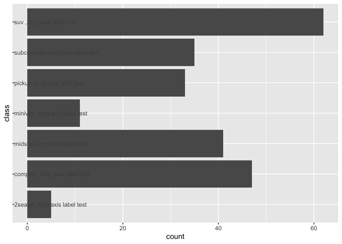
显然上面这个方法比较麻烦,既然提取到了y轴的grob,其实我们可以通过提取该grob的宽度,然后通过设置它的margin,使其左移。
wd <- grid::convertWidth(
  y.label.grob[["widths"]][1],
  "cm",
  valueOnly = TRUE
)
# margin
p2 + theme(axis.text.y = element_text(margin = margin(0, -wd, 0, 0, "cm")))
同时我们看到,通过修改grob结果label并没有全部在bar中,这是因为ggplot在画图区域坐标轴边界设置了padding,可通过删除padding解决
p2 <- p2 + scale_y_continuous(expand = c(0, 0))
p2 <- p2 + theme(axis.text.y = element_text(hjust = 0))
gp <- ggplotGrob(p2)

wd <- grid::convertWidth(
  y.label.grob[["widths"]][1],
  "cm",
  valueOnly = TRUE
)
# margin
p2 + theme(axis.text.y = element_text(margin = margin(0, -wd, 0, 0, "cm")))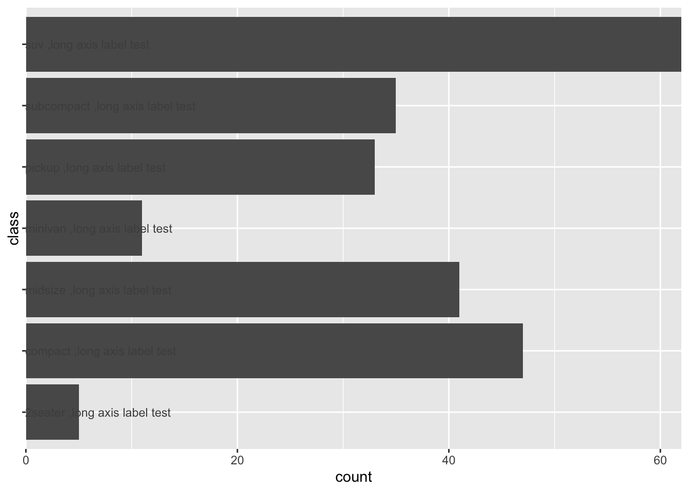
总之,geom_text代码相简单,修改grob麻烦一些。但是推荐使用修改grob,通过观察图形我们可以发现这两种方法添加的label字体不一致,这是因为geom_text默认字体属性和坐标轴label字体不同,而通过修改grob可以保持跟原有图形label字体一致,同时需要对ggplot的底层及grid的用法有一定了解。